MIMIMAL
UX | UI | Mobile
Website redesign work in progress. Proceed with caution! :)
OVERVIEW
Mimimal: An intuitive, modern, and minimal OS for us.
VISION STATEMENT
The Mimimal OS is an operating system for the Millennial generation. OS for us. With quick to access experiences, aesthetically-pleasing designs, and task-achieving features, Mimimal aims to be the future of operating system experiences.
PROBLEM SPACE It was common across apps that were popular among the Millennial population such as Snapchat, Instagram, and VSCO to have minimal interfaces, icons instead of labels, and less navigation and interaction required to achieve tasks. However, the UX and UI were not translated outside of these apps, namely in smartphone OS's. There was a disconnect between the everyday apps Millennials used and the OS that was interacted with.
CHALLENGES
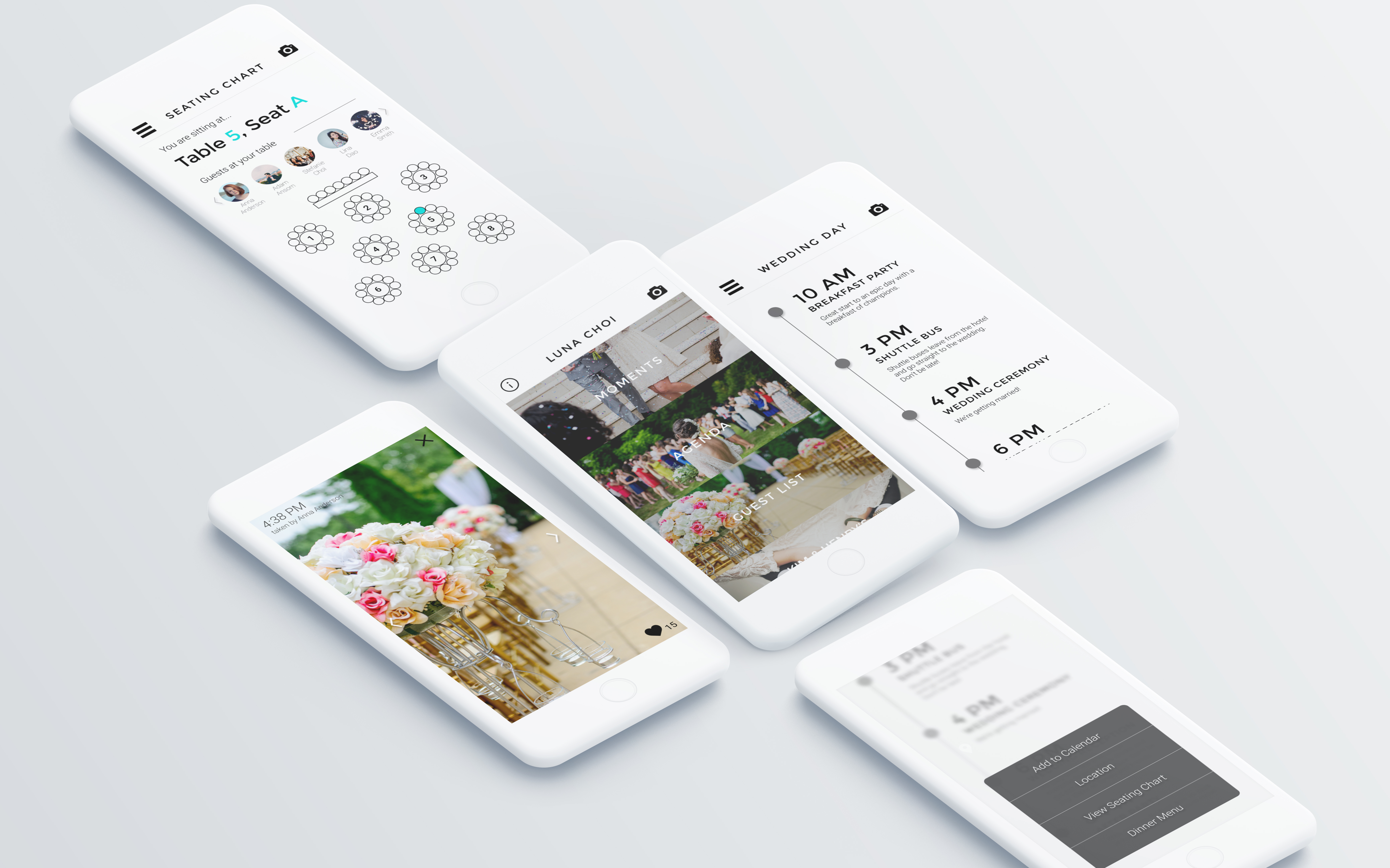
Not iOS, Android, or Windows, but something entirely new. Building Mimimal from scratch in 10 weeks was a challenging task and its design language went through numerous iterations. The 17 core apps of this new operating system also had to be designed from the bottom up and be adapted to Mimimal's design language and style guide.
GOALS
Design an intuitive, modern, and minimal mobile operating system designed by Millenials for Millenials.
BRAINSTORMING AND RESEARCH
AKA: Defining a Millennial
USER INTERVIEWS
To determine and discover what problems Millennials faced when using existing operating systems (iOS, Android, Windows), I conducted interviews with Millennials who are current or former users of these operating systems.
+ "What do you value in a smartphone operating system?"
+ "Are there any frustrations you face when using the features of your phone's operating system?"
+ "What are some features that you wish existed on your smartphone?"
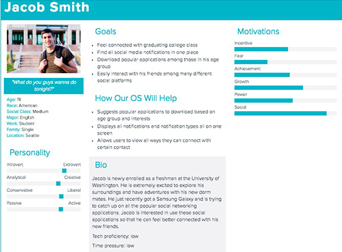
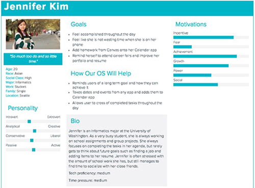
USER PERSONA
My team members and I were also Millenials. There were frustrations and desires that we personally had that were also in line with those of our interviewees. Our users informed us they...
+ Wanted a "Snapchat feel" where one swipe = navigation success
+ Desired modern and minimal designs; fewer words more icons
+ "Have the machine do it for me"
Through our user research (and input from ourselves as fellow Millennials), we created two personas that portrayed the desired synergy between Millennials and smartphone operating systems.
THE BREAKDOWN OF AN OPERATING SYSTEM
We were making a whole new operating system after all. To do so, we needed to understand the content of the core apps, create UI patterns for the cohesiveness of our OS, and develop guidelines for the system's main interactions, transitions, motions, and gestures.
Our 7-member team all had different technical backgrounds and design styles. Coming together to lay out main elements of Mimimal helped bridge our differences to create an OS with cohesive visuals and experiences.
UX GUIDELINES
I researched existing and intuitive types of user gestures, interface animations and motions, and page transitions. I determined what fit best with our vision statement and created a guideline to follow.
Interactions are to be >> CLEAR, MINIMAL, RESPONSIVE
Transitions are to be >> QUICK, GUIDING, RE-ESTABLISHING
Motions are to be >> NATURAL, SIMPLE, COHESIVE
TRACKPAD INNOVATION
To innovate the home button, the early stages of our "Trackpad" started with incorporating main gestures that went beyond the capacity of the screen. The Trackpad was made to minimize the vertical movement of users' fingers in order to achieve navigation tasks.
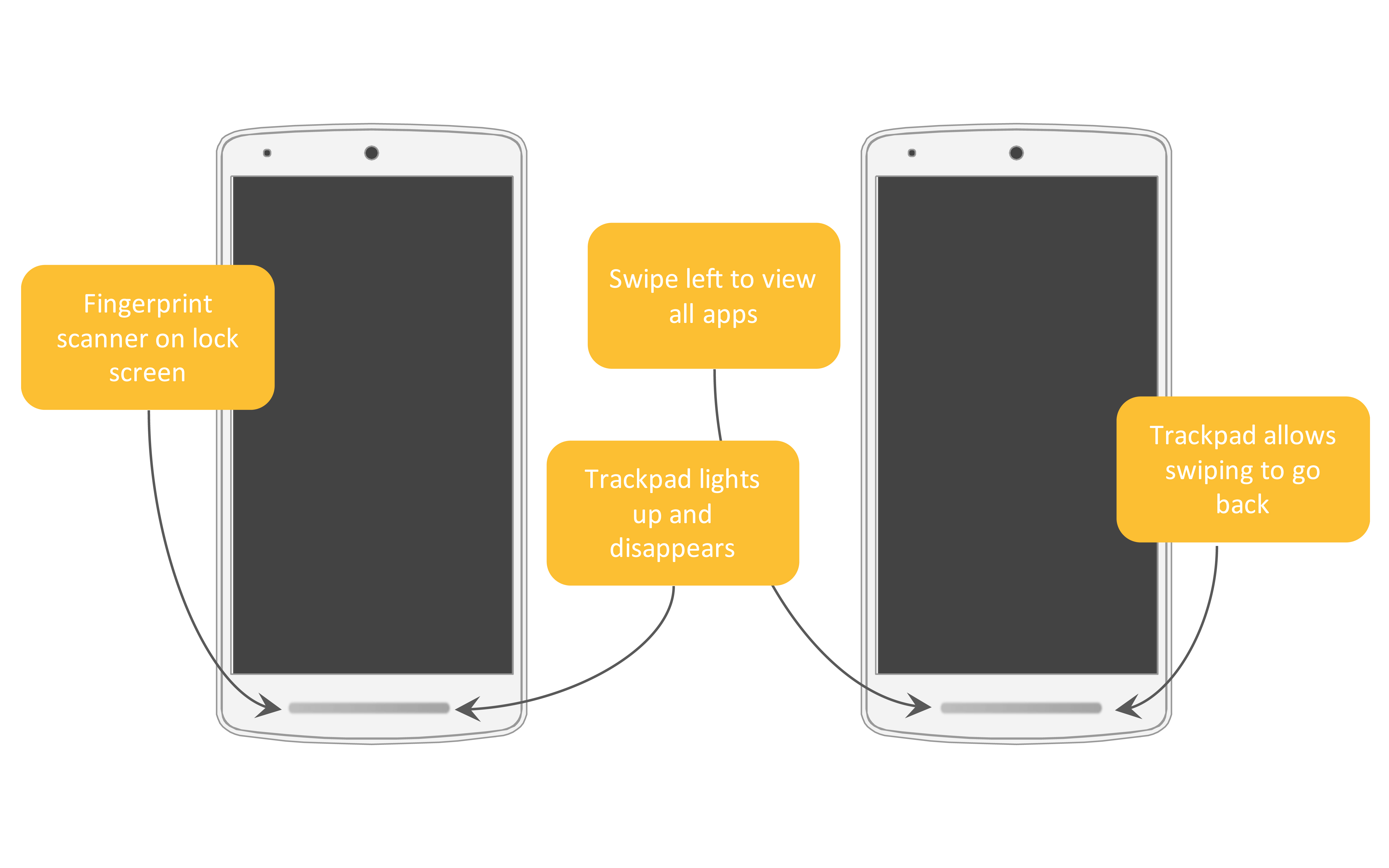
Mimimal OS Trackpad mockup
DESIGN SPRINTS
In the 7 week period of sketching, wireframing, and prototyping the interfaces for our 17 core apps, Mimimal's UI styleguide went through 2 complete turnovers. This included 3 changes to icon styles, 2 changes of the main font, 2 changes of the entire color palette, and many, many different iterations of our core app interfaces.
At first, we struggled to fit Mimimal's visual designs with Mimimal's vision statement. After several sessions of feedback from professionals and Millennial users, we were able to reevaluate and iterate our designs to uphold Mimimal's characteristics of intuitive, modern, and minimal.
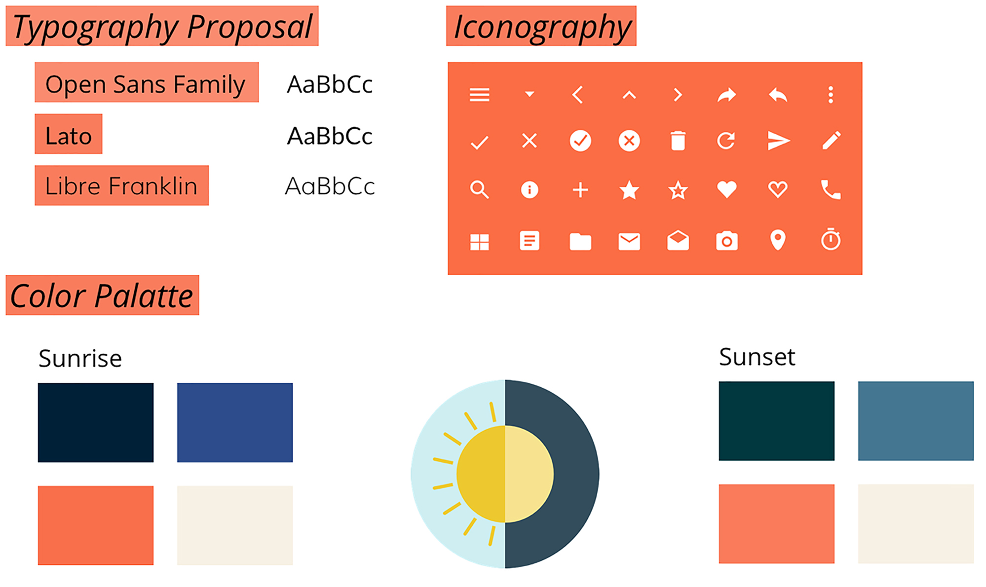
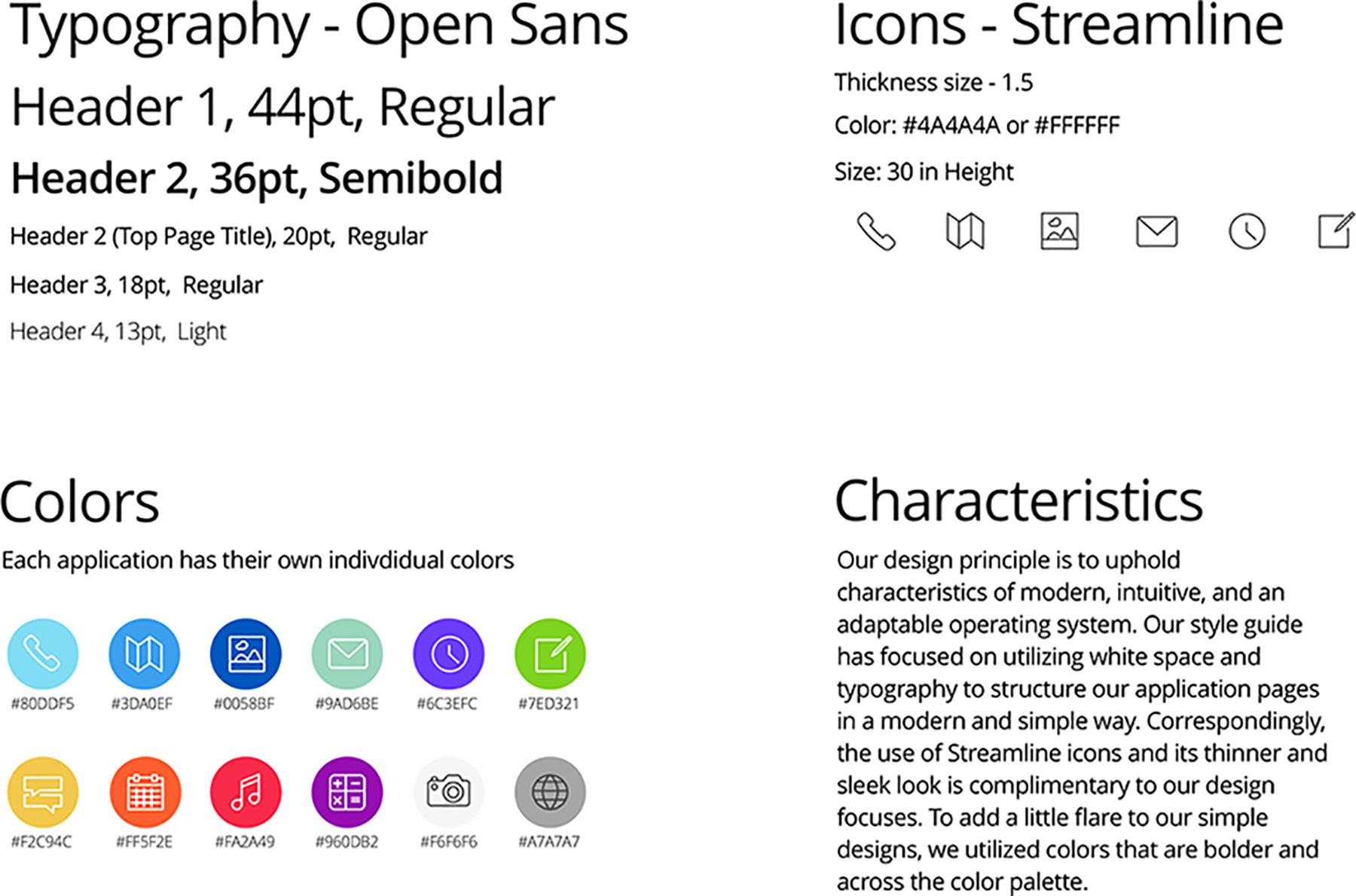
Left: Mimimal's first styleguide. Right: Mimimal's final styleguide.
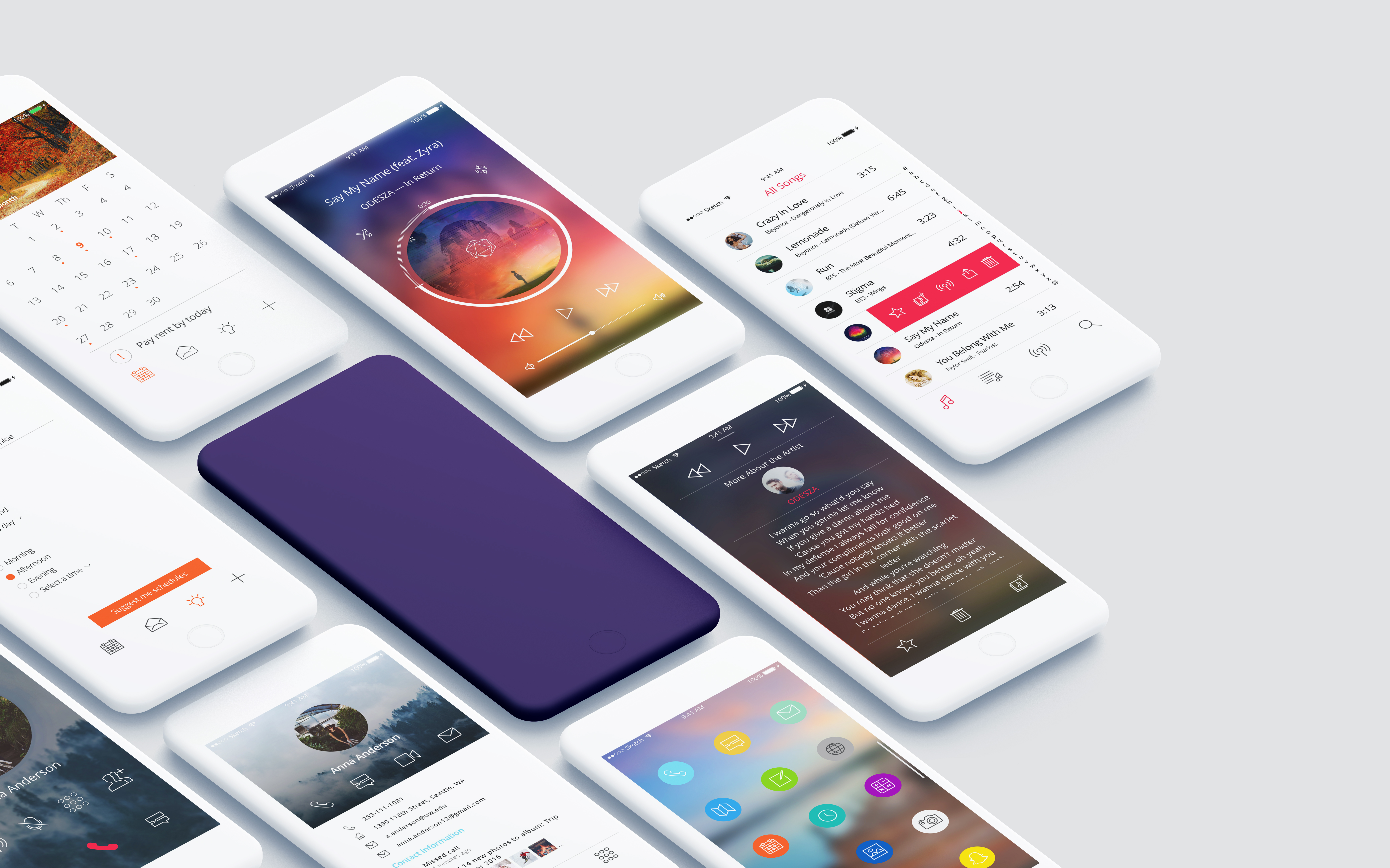
MIMIMAL'S INTERFACES
Below are the interfaces for the Calendar, Contacts and Dialer, and Media Player that I designed from start to finish and iterated on.
I designed interfaces with the visually aesthetic preferences of Millennials in mind.
I designed experiences with the "fast" and "smart" desires of Millennials in mind.
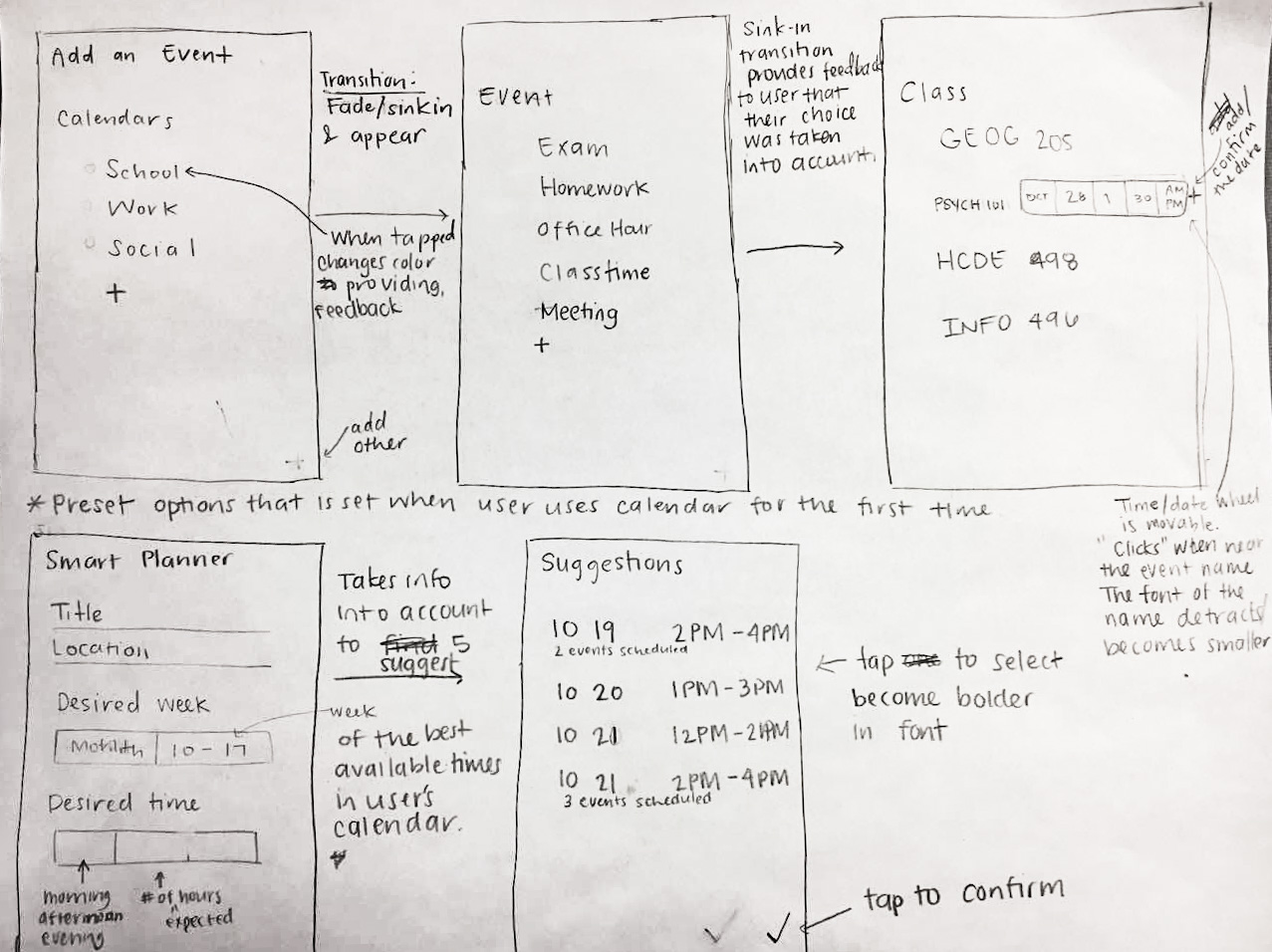
CALENDAR
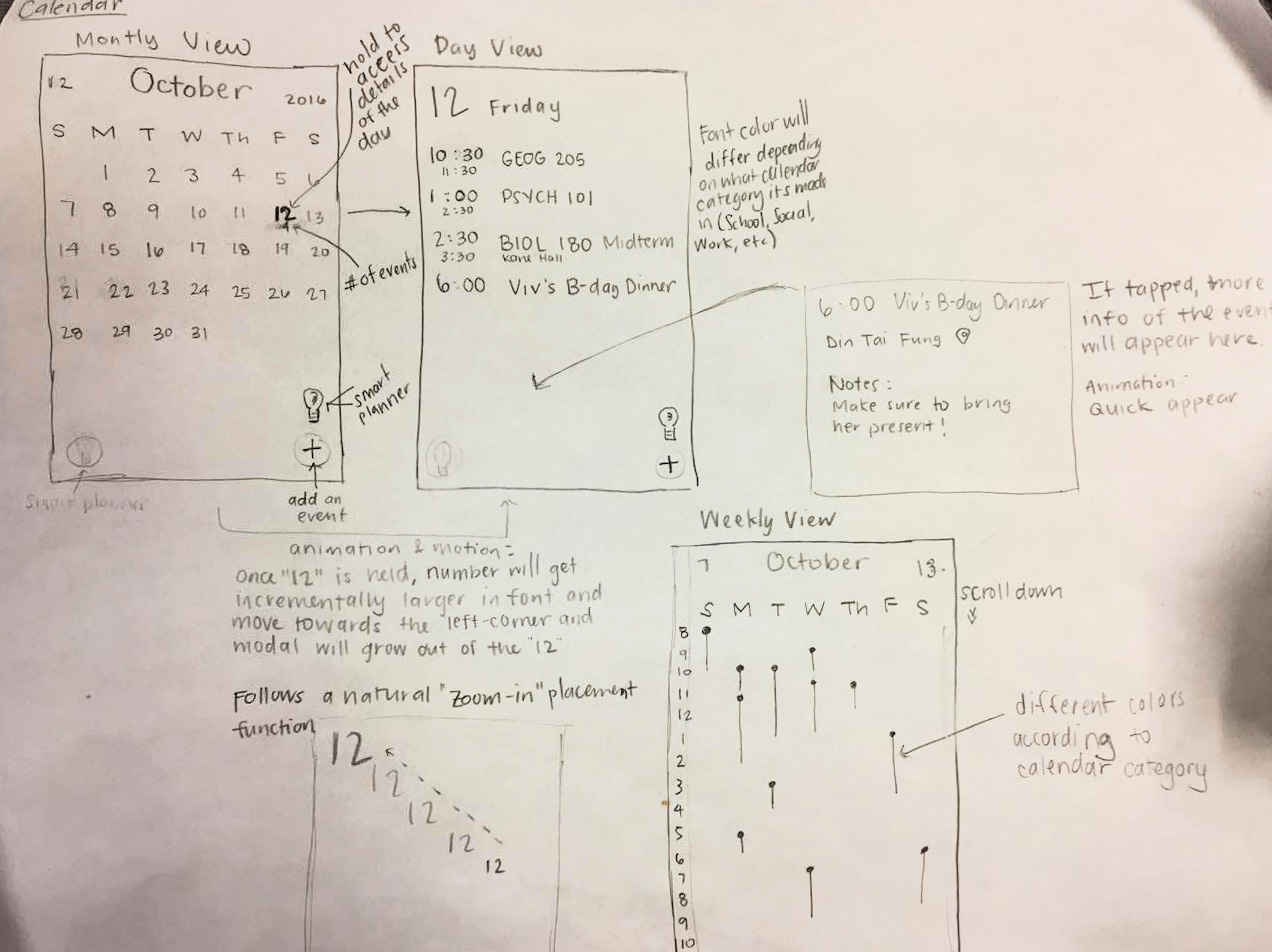
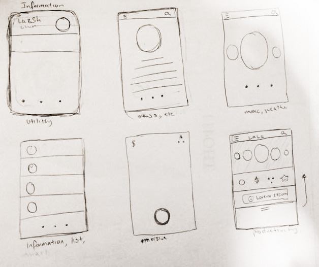
Sketches of the calendar and smart scheduler.

Calendar view
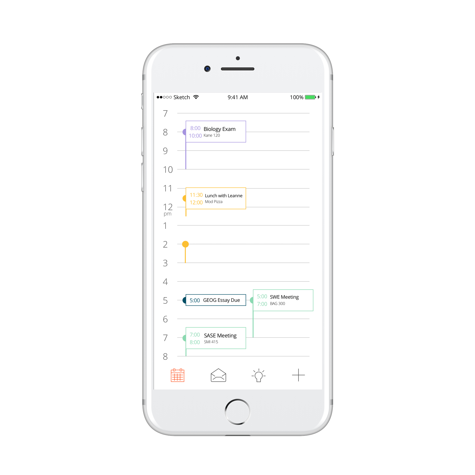
Day schedule
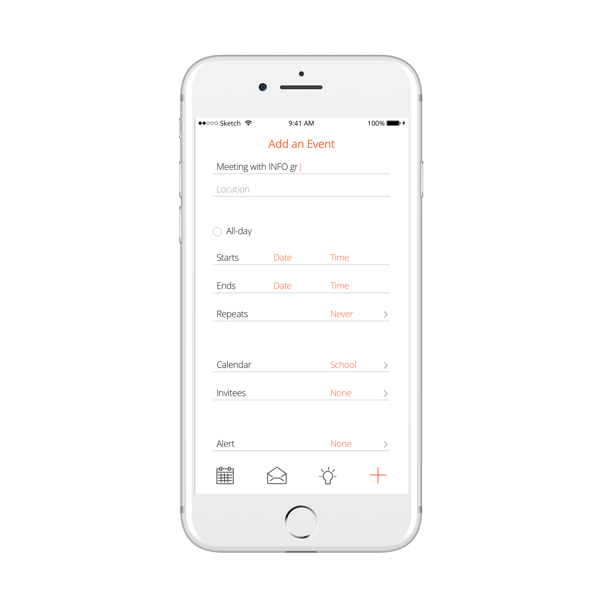
Adding an event to the calendar
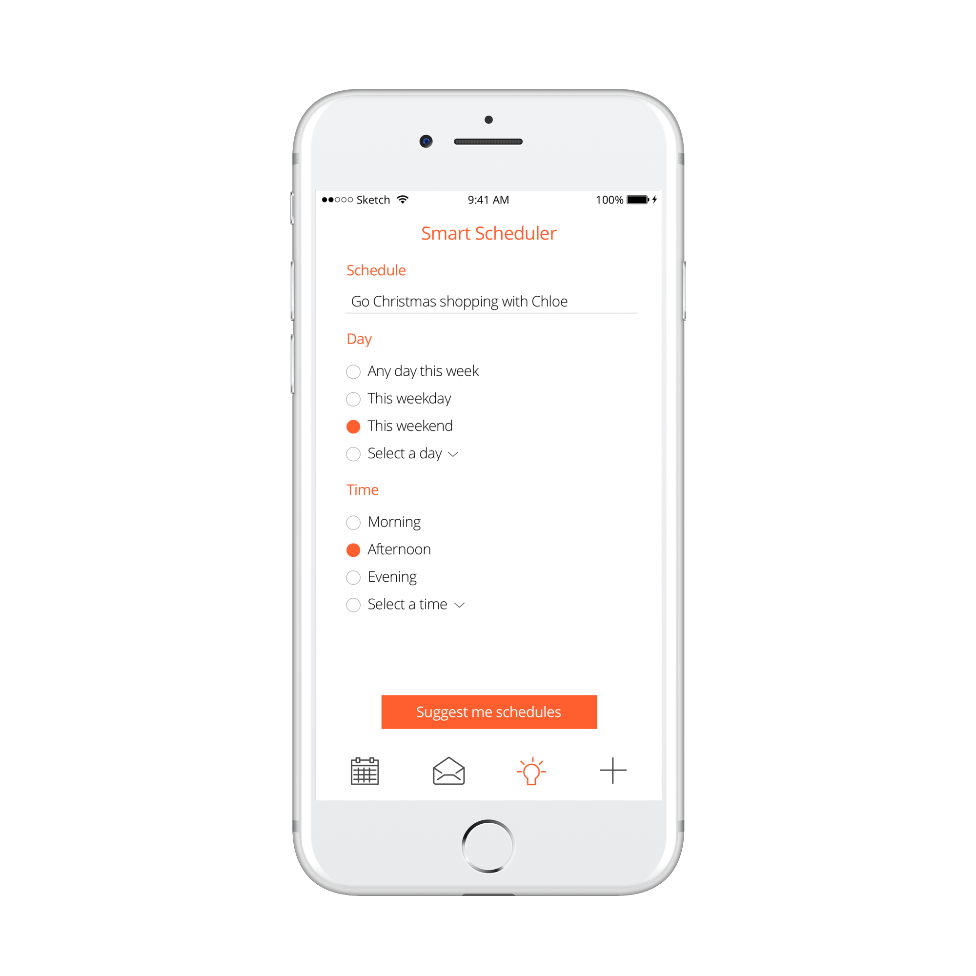
Smart scheduler that enables users to schedule an event that best fits their calendar without having a planned date and time.
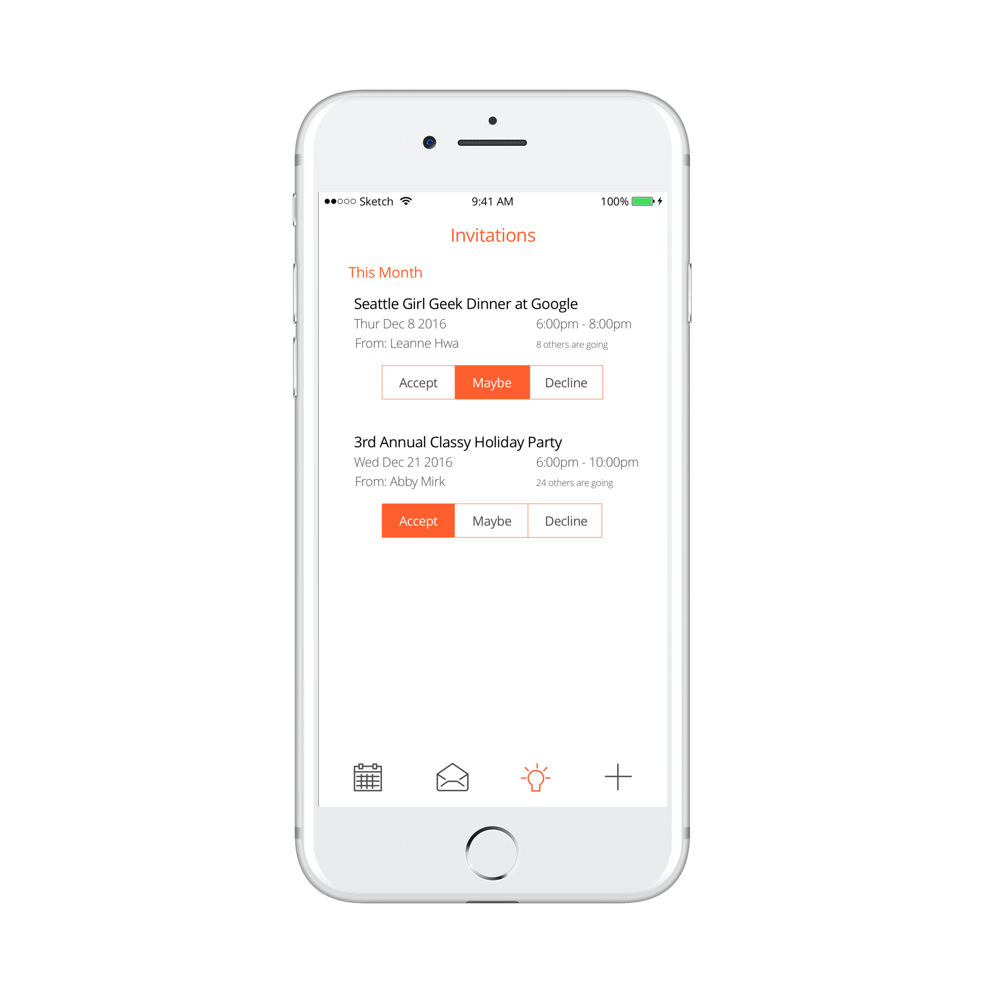
E-invites are organized and added to the calendar automatically once accepted.
CONTACTS AND DIALER
Sketches of the contacts and dialer.
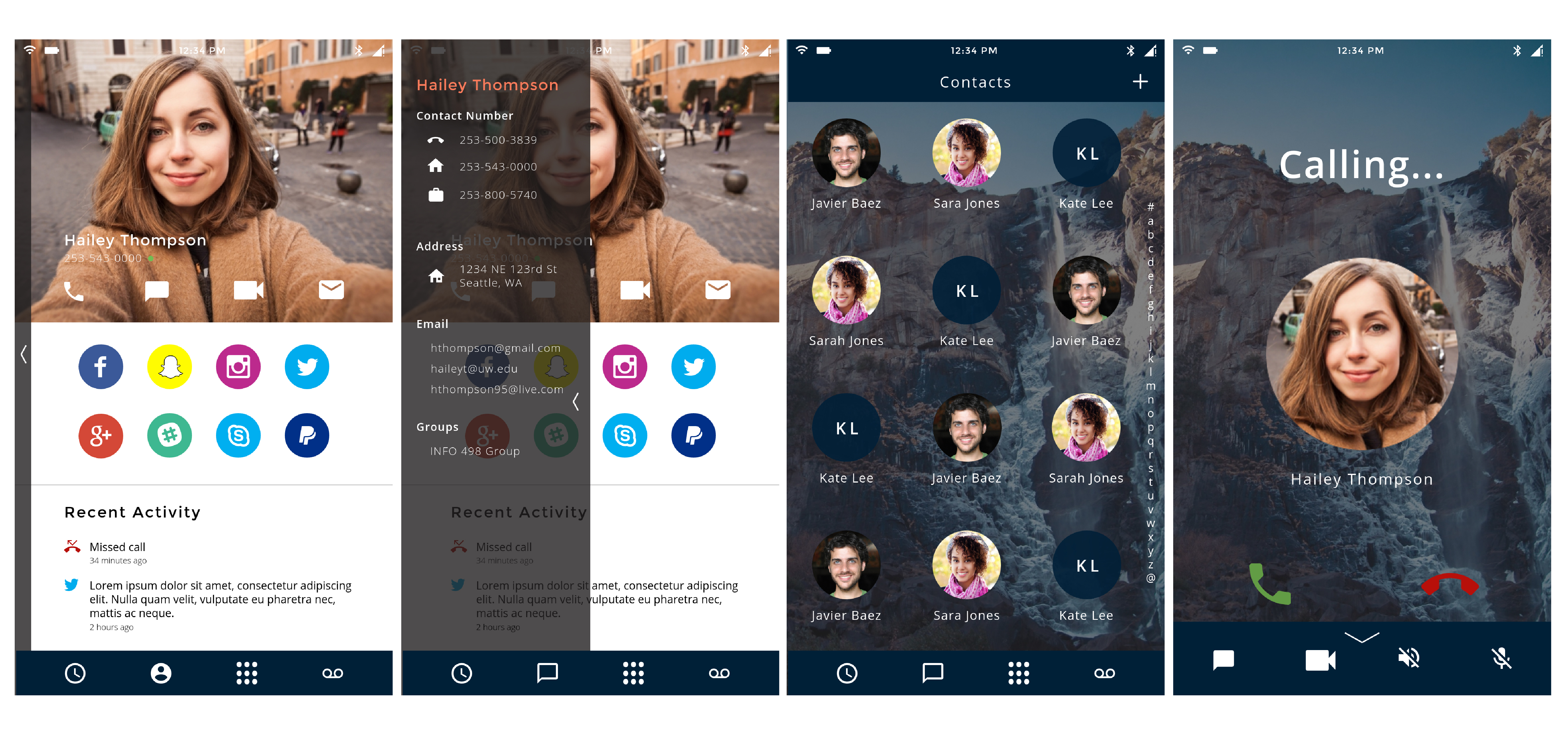
First prototype of the contacts and dialer.
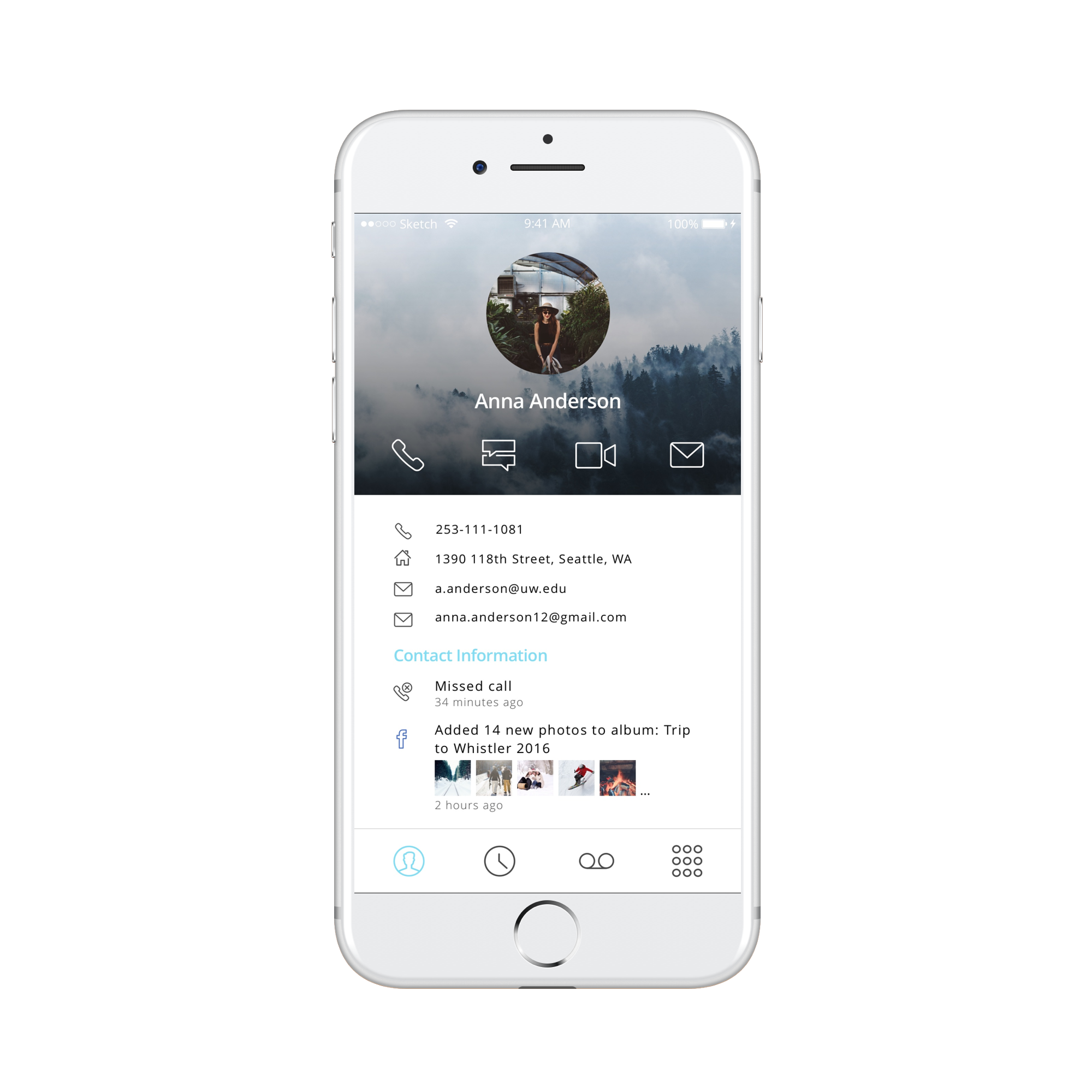
Contact information
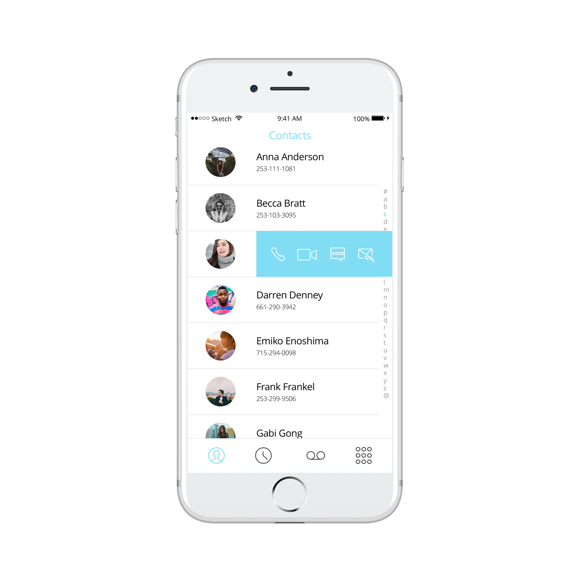
List of contacts, swipe left to access quick functions
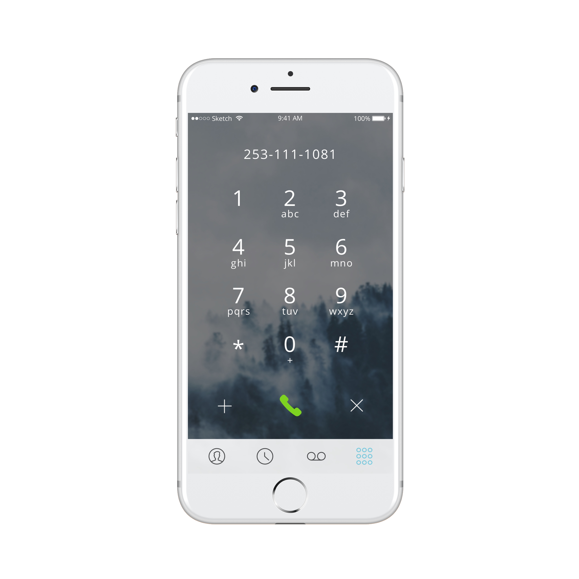
Dialer
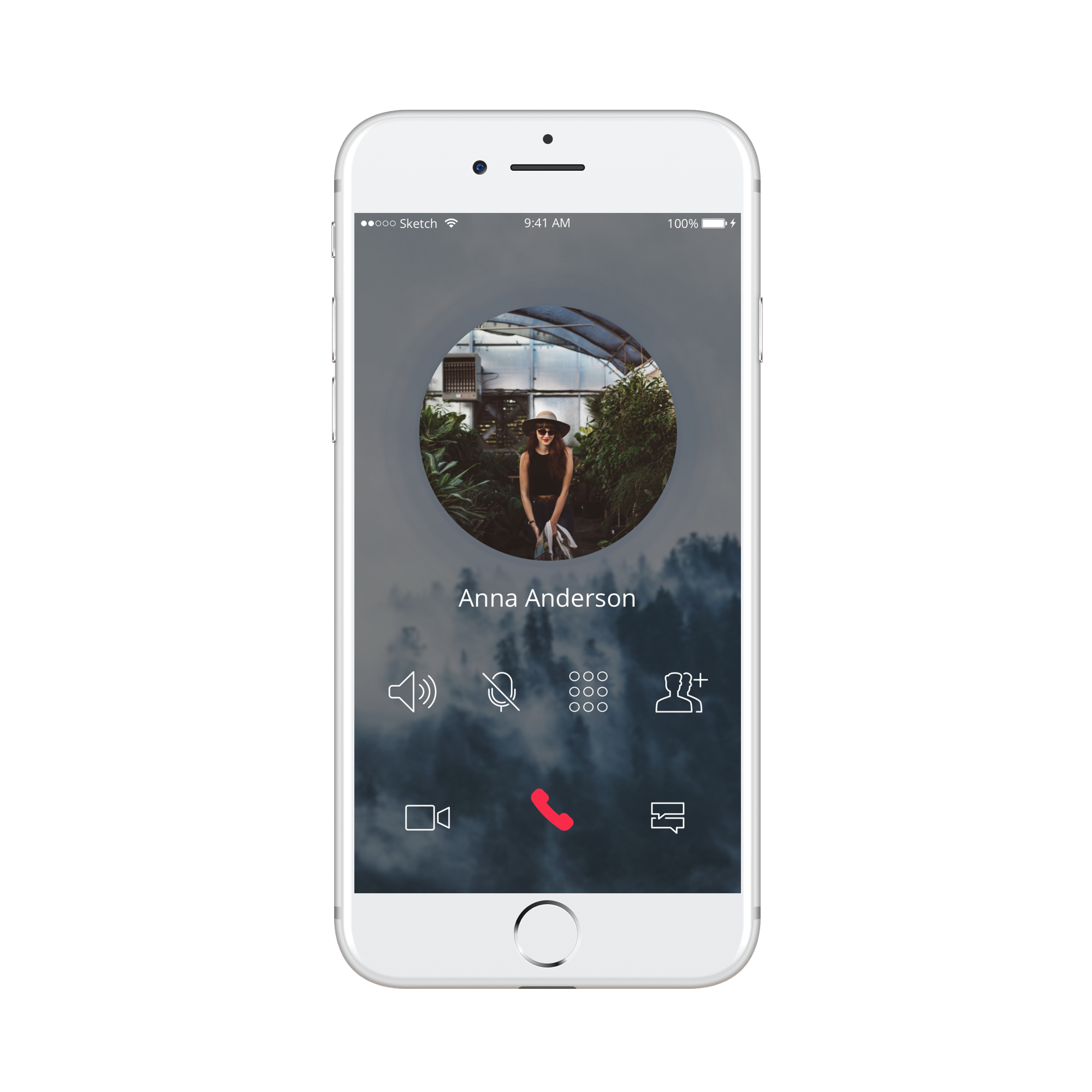
Dialing contact
MEDIA PLAYER
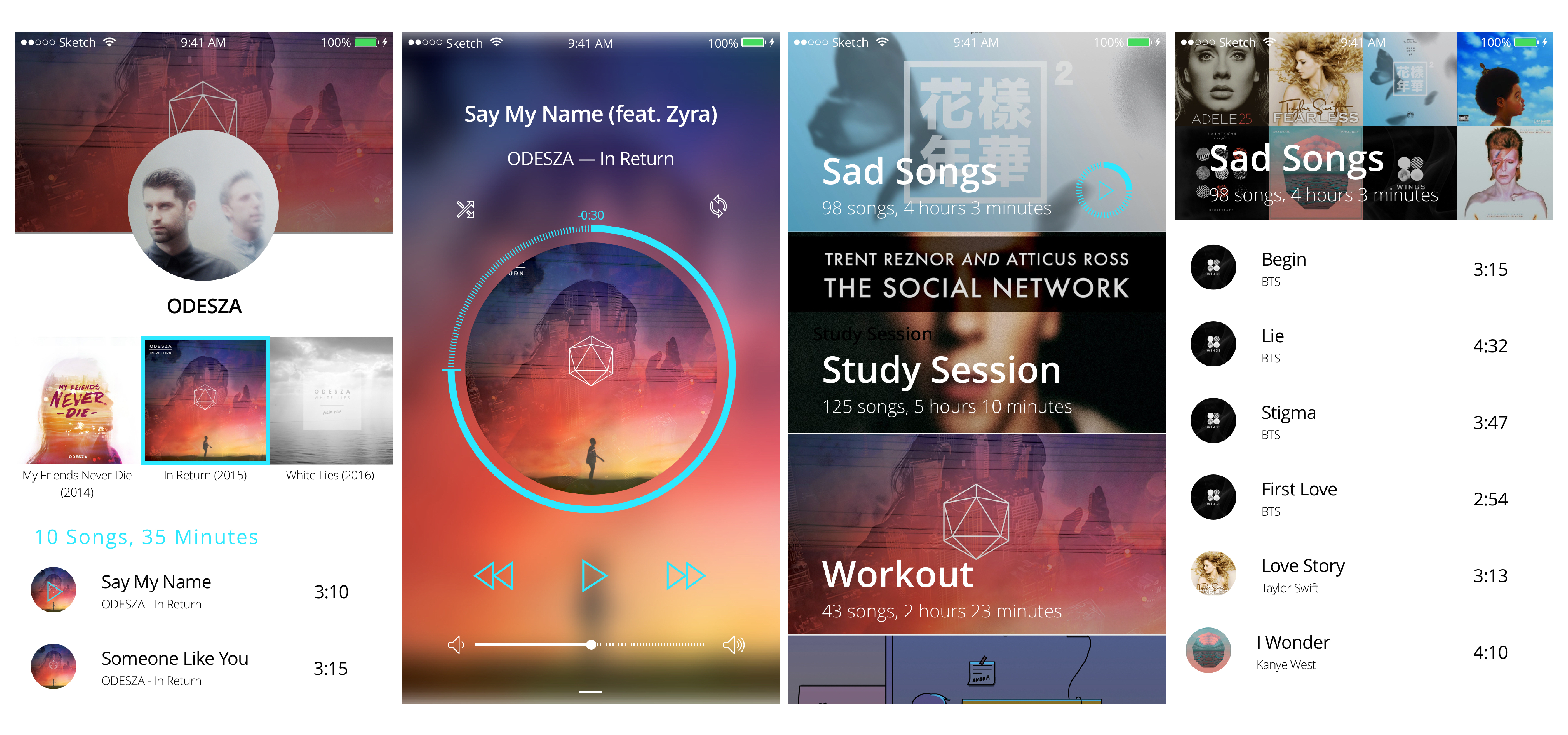
First prototype of the media player.
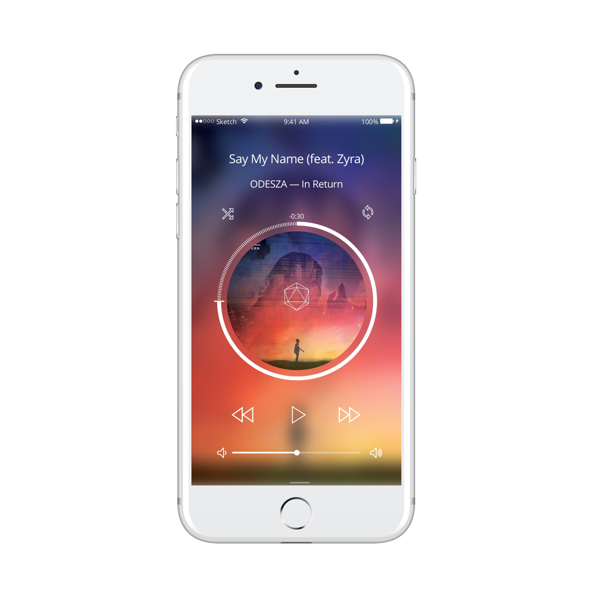
Music player
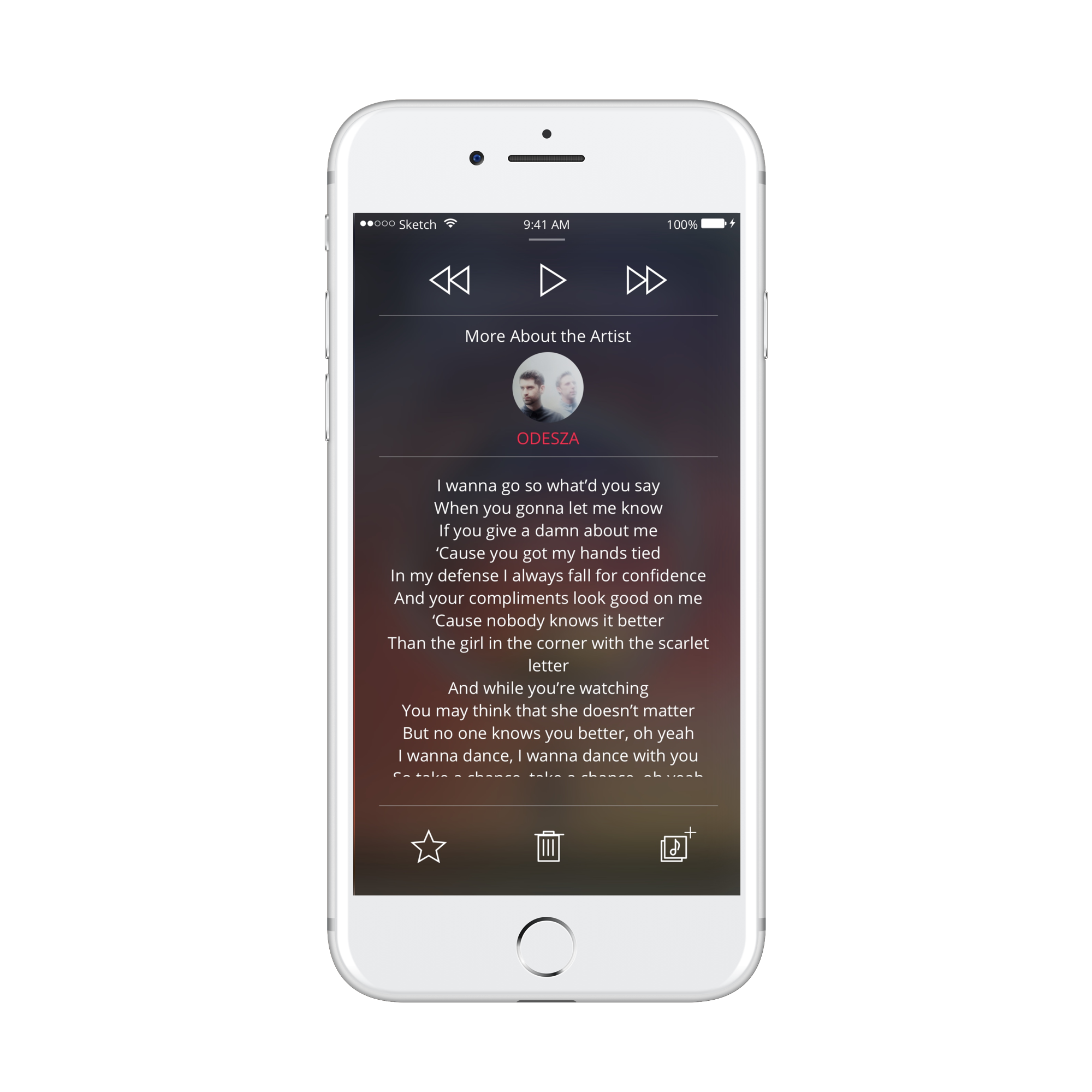
Swipe up from music player to view lyrics and artist profile
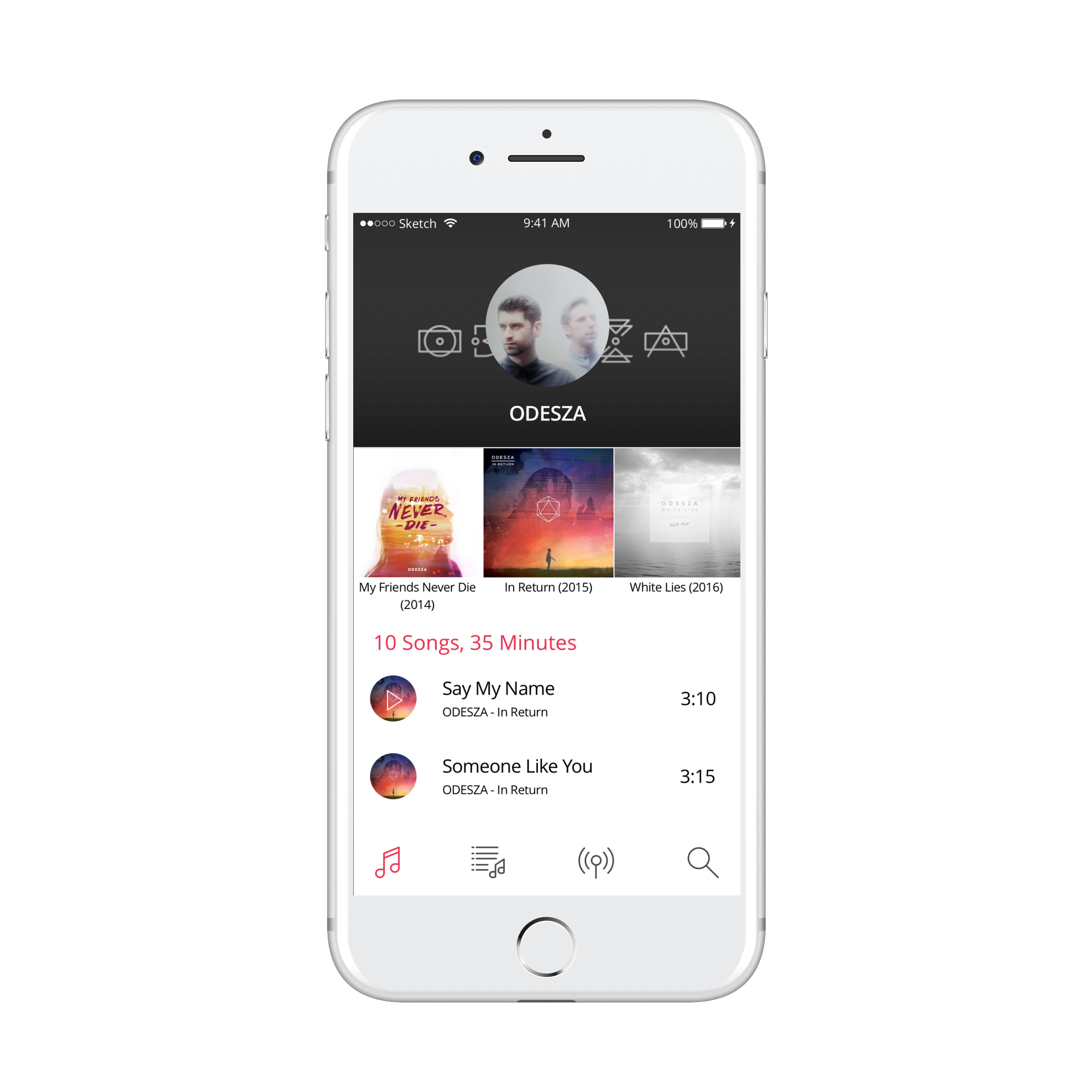
Artist profile page
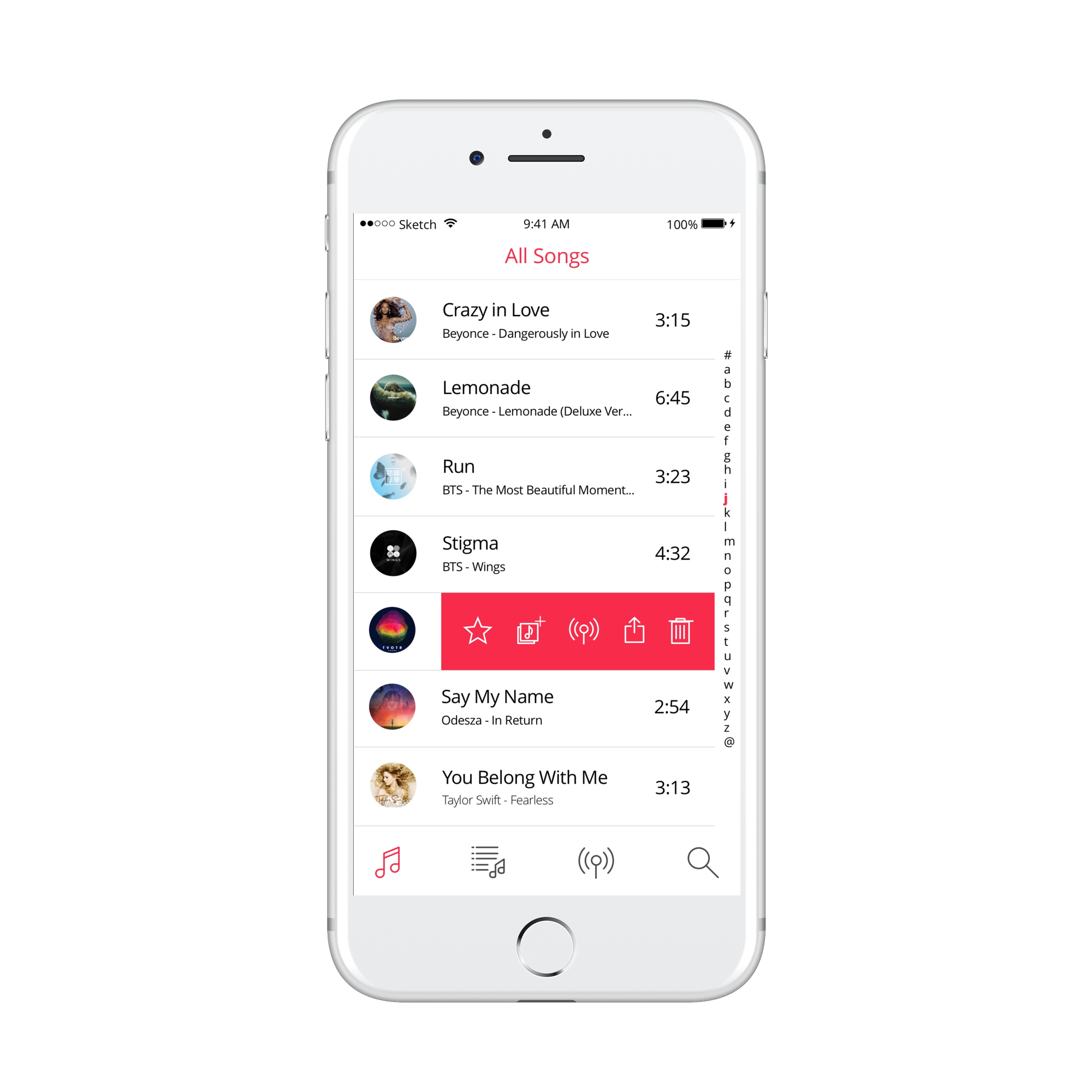
Song library
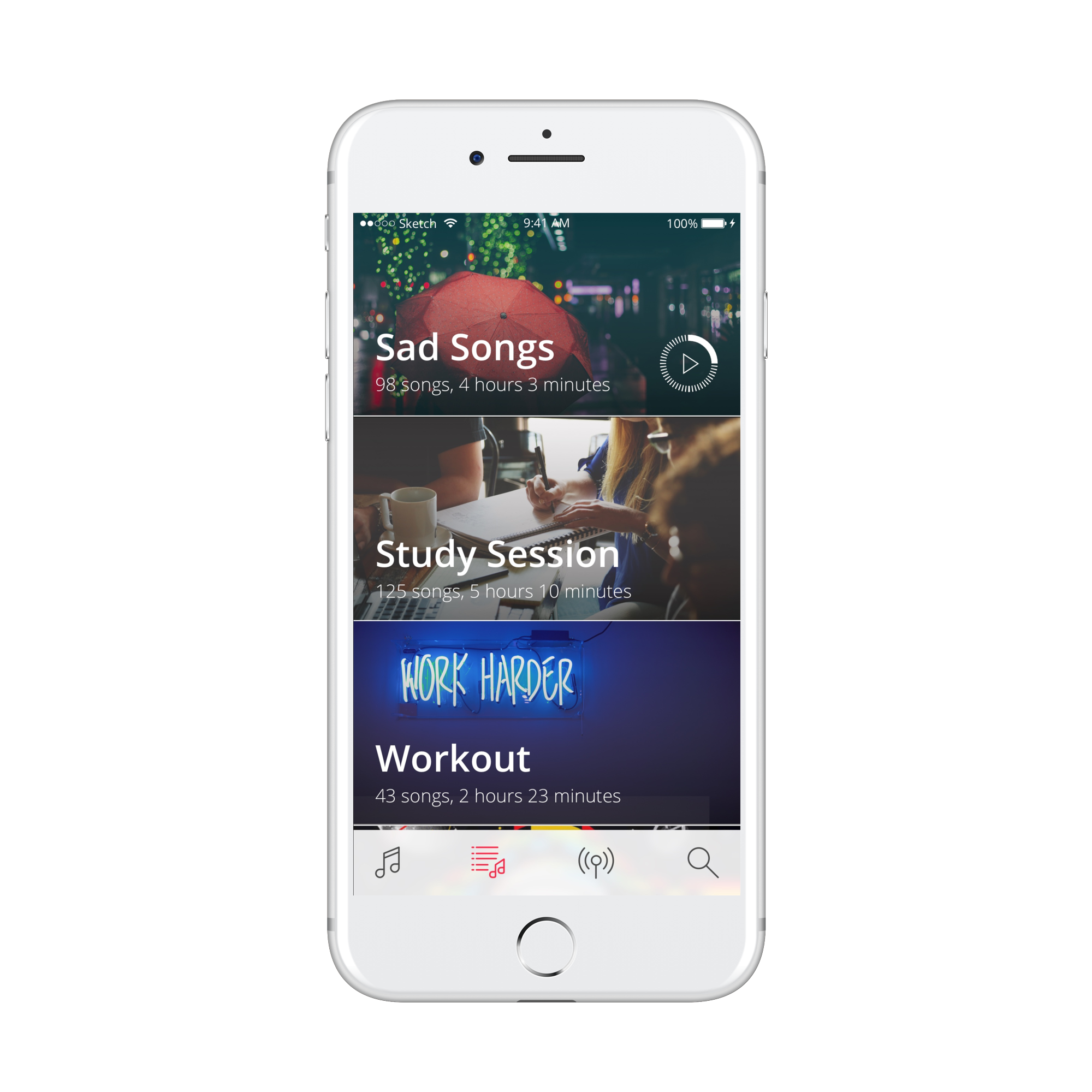
Playlists
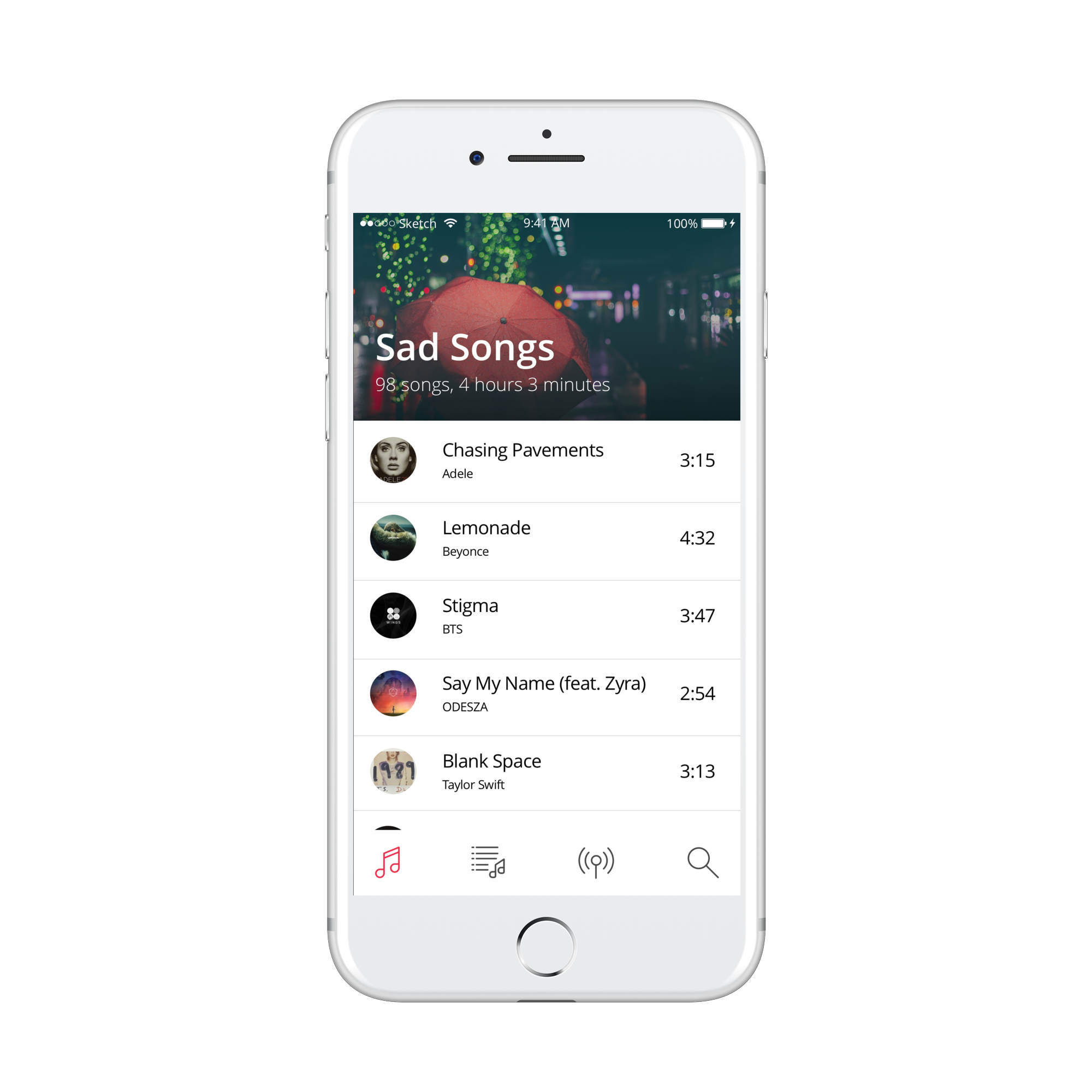
Songs in playlist
REFLECTION
This project was the first time that I had designed something as comprehensive as an operating system. I wasn't only designing an app, I was designing an identity. In building this identity from scratch, I felt the extent of cohesiveness, collaboration, and communication that was needed for team design work. The 7 of us were all in charge of designing separate apps, therefore the first iterations of our interfaces were not cohesive because our different design styles.
In the 6th week, the team and I dedicated a 3-hour meeting to communicate, iterate, and solidify our design guidelines again. The turning point for us was not only when we thoroughly flushed out our styleguide together, it was when we reevaluated the vision statement together. Before, in the haste of getting designs out to meet deadlines, we neglected what our Millennial users wanted Mimimal's experience to be like: intuitive, modern, and minimal. Adapting these characteristics in our later iterations was the crucial wake up call that we needed for the team.
Three takeaways from this project:
- Don't lose sight of the original vision
- Communicate, communicate, communicate. Designers express themselves through their creations, but the creations express themselves through the designer's ability to communicate.
- It always comes back to our users' needs and desires. Designers create solutions, but never forget who the solution is for!
I took on many hats for this project. UX and UI designer, user researcher, leader, and collaborator. As one of my first large-scale design projects, creating the Mimimal OS was the comprehensive work and challenge I needed to start understanding what it is like to be a UX & UI designer and working on a design team. Thanks to Mimimal OS my passion for design strongly continued on.

see more!